Micro
Your virtual shopping assistant is here!
Senior Project - User Experience Design -2020
Logistics
Responsibilities: user research, user processes, visual design, prototype design, user testing, and incorporating user feedback into design iterations.
Role: UX/UI Designer
Concept: User Experience Design, Mobile Application
Duration: 8 weeks
Tools: Adobe XD, Adobe Illustrator, Adobe Photoshop, InVision
About
When COVID-19 just had broken out, and our radical lifestyle had changed. Most of the businesses closed, and all the cities shut down. People practiced social distancing, so it made our life more complicated. However, grocery stores remained a necessity during this pandemic, but not everyone was ready for a trip to these stores.
Micro is a new mobile application, and it would help people shop online easily and more conveniently at home. This mobile application would provide users with a better experience by having a virtual assistant to help them shop online.
01. The Problem
- 🗣 Online services are lacking communication between users and online stores
- 🥦 Users always expect to receive fresh products, but they don't have options to select thefreshness of products that users want
- 🚕 Due to the high demand for online orders, online stores run out of items, and they are not availableto deliver to users right away

02. The Opportunity
Design a new platform that provides a better experience for online shopping groceries by creating a safe place where users can communicate better with grocery stores.

03. Quantitative Success Metrics

04. Qualitative Success Metrics

05. Design Challenge
This design challenge focuses on the accessibility and usability of user experiences that help to solve the chaotic movement during the pandemic.

06. Solution
Create a mobile application for online store shopping that allows users to search and buy groceries while they don't need to be at grocery stores physically.
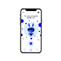
Stay connected to online stores by chatting with a virtual assistant
Have a virtual assistant to help my users to walk through the online store. To create a better experience, a virtual assistant would have friendly features, and my users would be more comfortable with the app. To help my user stay connected with grocery stores, they would get help by communicating with a virtual assistant anytime.


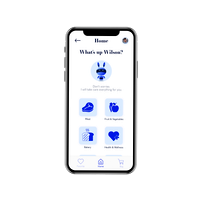
Organize information and improve result
With a chat box, and my users could ask what they need and save their time in shopping. A virtual assistant would create a better experience by asking more questions and analyzing the information from my users. It would improve the result, and they don’t have to scroll page to page to find items.
Guaranteed fresh products when shop for groceries
A virtual assistant would connect any sellers or staff at grocery stores, and my users would have the ability to check any products before they checkout. The grocery store would take photos of products, then send them to my users through a virtual assistant.The purpose is to create satisfying experiences for users, and they won't regret the purchase.

07. Competitive Analysis
I looked at direct other services like Amazon Fresh because they are a strong competitor in online grocery shopping. The summary of my findings includes:
- Online customer services are not always available, and users can’t get help right away. However, Amazon provides online staff to help shoppers, but sometimes these staffs lack knowledge of a product
- I found it's challenging to place an order, and users have issues with scheduling their orders due to the limitation of the day and time. They can't make an order right away, and users need to wait for hours or the next day. So, it's very inconvenient for online shopping
- The website/app only shows the stock images of products

08. Research
I did more survey and researches that focused on the behavior of how did people shopping online for essential items and how the virtual reality helped people during the quarantine. This research had given me a better insight on the situation of grocery stores to create potential solutions to face the challenge of users during the quarantine. The summary of my findings includes:

09. User Persona
I created two personas to help guide my design decisions by interviewing users with a wider age range. It helped me to explain the problem better, and I could understand the lack of the situation. Then, I found that users felt frustrated with searching the items when they couldn't find anything that matched their expectations, and they weren't sure who they should ask. Another problem is the limited variety of food in grocery stores, so users lacked many online shopping options.

What were users' top concerns?

10. Pain Points

11. User Journey Map
I created a user journey map to depict the behaviors of users during this pandemic. And it helped me to illustrate how they would feel at each touchpoint and what kind of experience users would get from my product.

12. Task Flow
I created a task flow to describe how this app should work and brainstorm different ideas for features. This structure helped me follow the project better and kept track of what I needed to focus on more. And this task flow helped me define where I should solve these pain points from previous steps, so users could have full access to what they need during shopping.

13. Ideation
Next, I brainstormed and worked on the concept of a virtual assistant. The idea is that's sync the data system from the app to grocery stores to provide better information for my users. An example is when my users would like to see a product in real-time, so they would have to ask a virtual assistant. Then, this virtual assistant needs to work with the staff at grocery stores, and they have to take photos and send them back to a virtual assistant. I made this decision because it would make the process of searching and analyzing information faster and smoother. All grocery stores would have a better understanding of the needs, while users would be more satisfied.

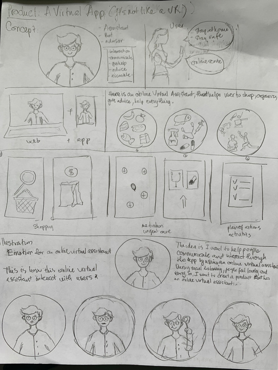
14. Early Sketches
I started sketching on paper to get some ideas for the visual design of the app. This stage helped me visualize the theme and gave me some sense of the visual directions to my project.Then, I explored the concept of a virtual assistant by adding different facial expressions to provide better communication with our users. Also, I tried to expand the selection of services for users by adding health-care, pharmacies, self-care, etc.

15. Visual Design
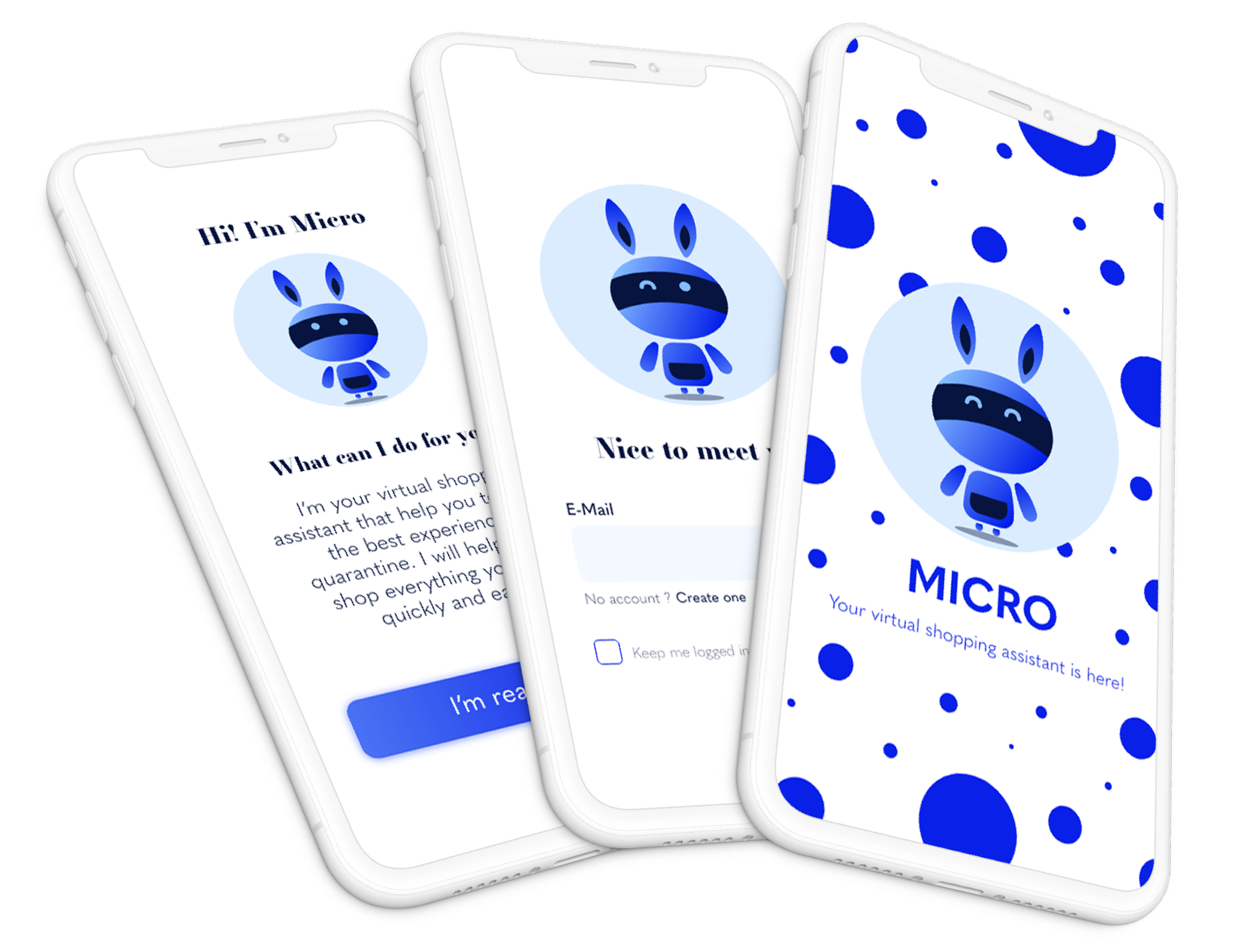
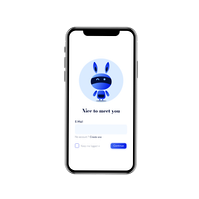
I redesigned a virtual assistant because I wanted it to look minimalist to showcase the brand. I didn't keep my original ideas from my sketches stage because the mission of the app is everyone should feel comfortable using it. So, I decided to create a virtual assistant in neutral gender, and it could be male or female based on my user experiences.

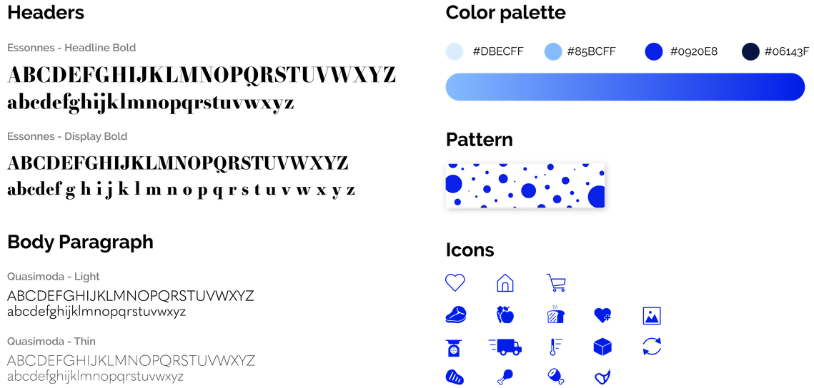
16. Style Guide
I chose "Micro" as a brand name because it fitted with applicable, accessible, usable, and intelligent. I also found the name refers to the processing of tiny organisms, organic structures, or certain substances. It matches well with the functions and purposes of this mobile application. Moreover, I chose the blue color as the primary color because it presents for the mind and is essentially soothing. It's also associated with intelligence, communication, trust, and efficiency. Also, I added different shades of blue into the color palette because I believe they will stimulate clear thought and lighter, while soft blues will calm the mind and aid concentration.

17. Low-fidelity Wireframe
I conducted user tests on low-fidelity wireframes to understand how users should feel about the functions of Micro. I realized that the app was too complicated for my users with many features, and I found that some of the wireframes didn't have a clear direction.With adding too many features, my users would feel confused about the usability of Micro. One of the features is "Be active" which didn't bring a good impression to user experiences, and it was hard for users to keep track of the data for their activities.

18. High-fidelity Wireframe
I revised and worked on the high-fidelity wireframe. I improved the user interface and added more visual design to the application. Also, I removed all the unnecessary parts such as healthcare or exercise because I don't want users to feel overwhelmed and distracted with many functions from Micro.


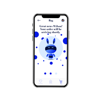


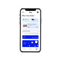


19. Final Product
20. Proposed Outcome
This mobile application hopes to meet the needs of people who need to buy groceries online and reduce the risk of infection. In addition, it is desirable to provide an experience where users can communicate and interact with the grocery stores through a virtual assistant. It would analyze the information to provide a better result for users during their shopping experiences.
In the future, Micro would be changing to provide an environment such as consumer habits because this mobile application would be more convenient, easier, and faster. After the pandemic, Micro would be server the users who are the elderly, the disabled, or people who cannot make the trip to the grocery stores.
21. Reflection
The final prototype was completed and received positive feedback about the branding. I know that there are a lot more features that can be added to this product.
- I would like to add more features to the selection of the market and incorporate them into the journey of users
- It could be more expansion in the delivery function of the app that how users could keep track of their orders and communicate to the delivering through a virtual assistant
- In the future, I would love to improve the user experiences with a virtual assistant by giving users the ability to design their virtual assistant
- If I have a chance to redo this project, I would love to do more user testings in person and collect more feedback from the shoppers at the grocery stores to have better information